Facelift - ReDesign eRecruiter
- Claudia Riegler (Unlicensed)
Header
Navigation
With our Redesign we changed the navigation header on top to make it more intuitive. Highlighted in green in the main navigation you can see the area where you are currently at. On the sub navigation the current site is underlined in green.
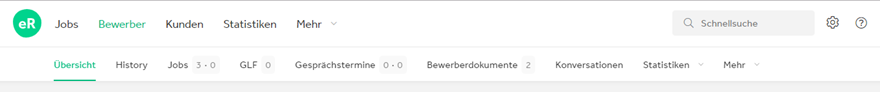
Scrolling
We did improve the usability of pages through hiding the header when scrolling downwards. As soon as the scrolling movement changes from downwards to upwards the header appears again. This allows us to show more relevant information on the current site.
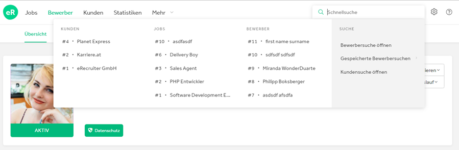
Search
To grant a high performing and easy to use search we did change the optical interface to a more modern look.
Workplace
Look & Feel
Detailed changes Im Zuge des Redesigns wurde der Präsentations des Arbeitsplatz überarbeitet und einige Detailänderungen vorgenommen, die eine bessere Bedienbarkeit sicherstellen sollen.
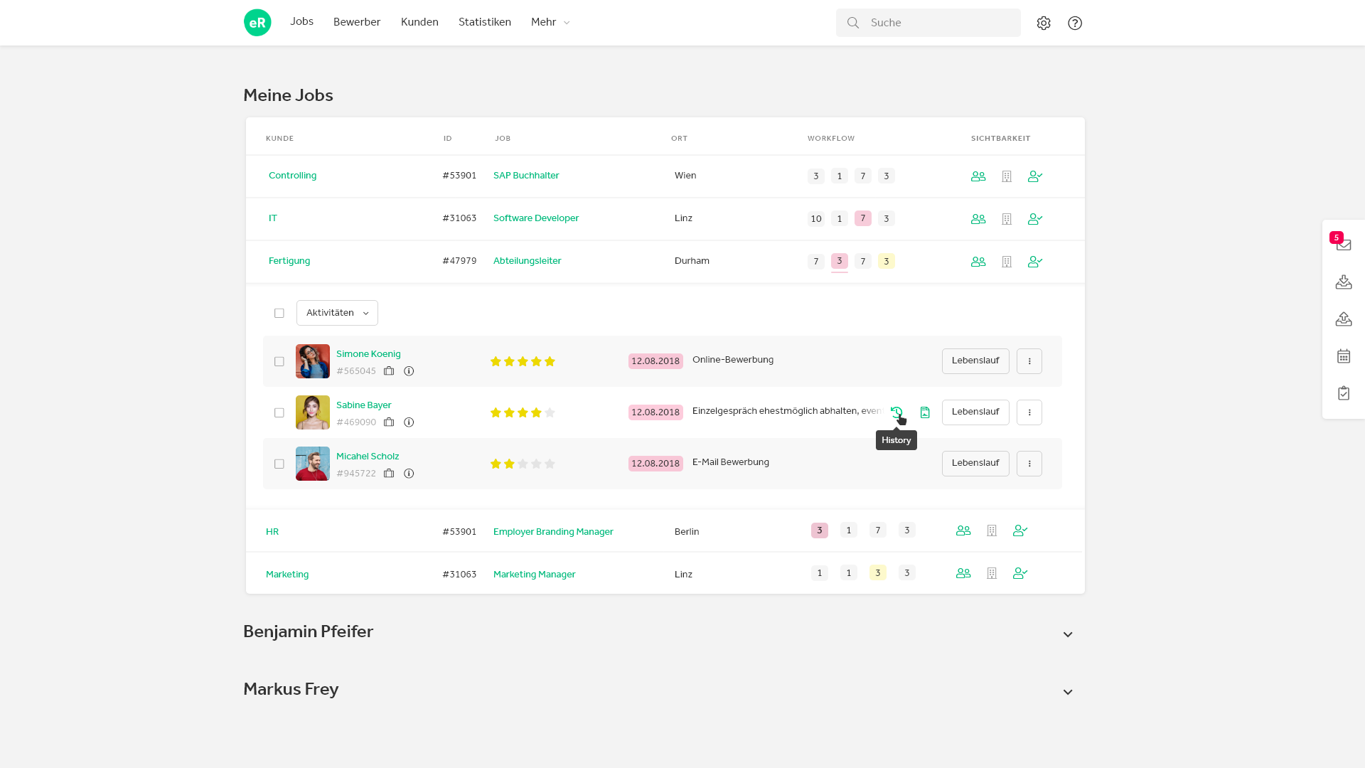
History & Report
To enable better overview regarding applications the icons for history and report are only visible by hovering on the applicant line.
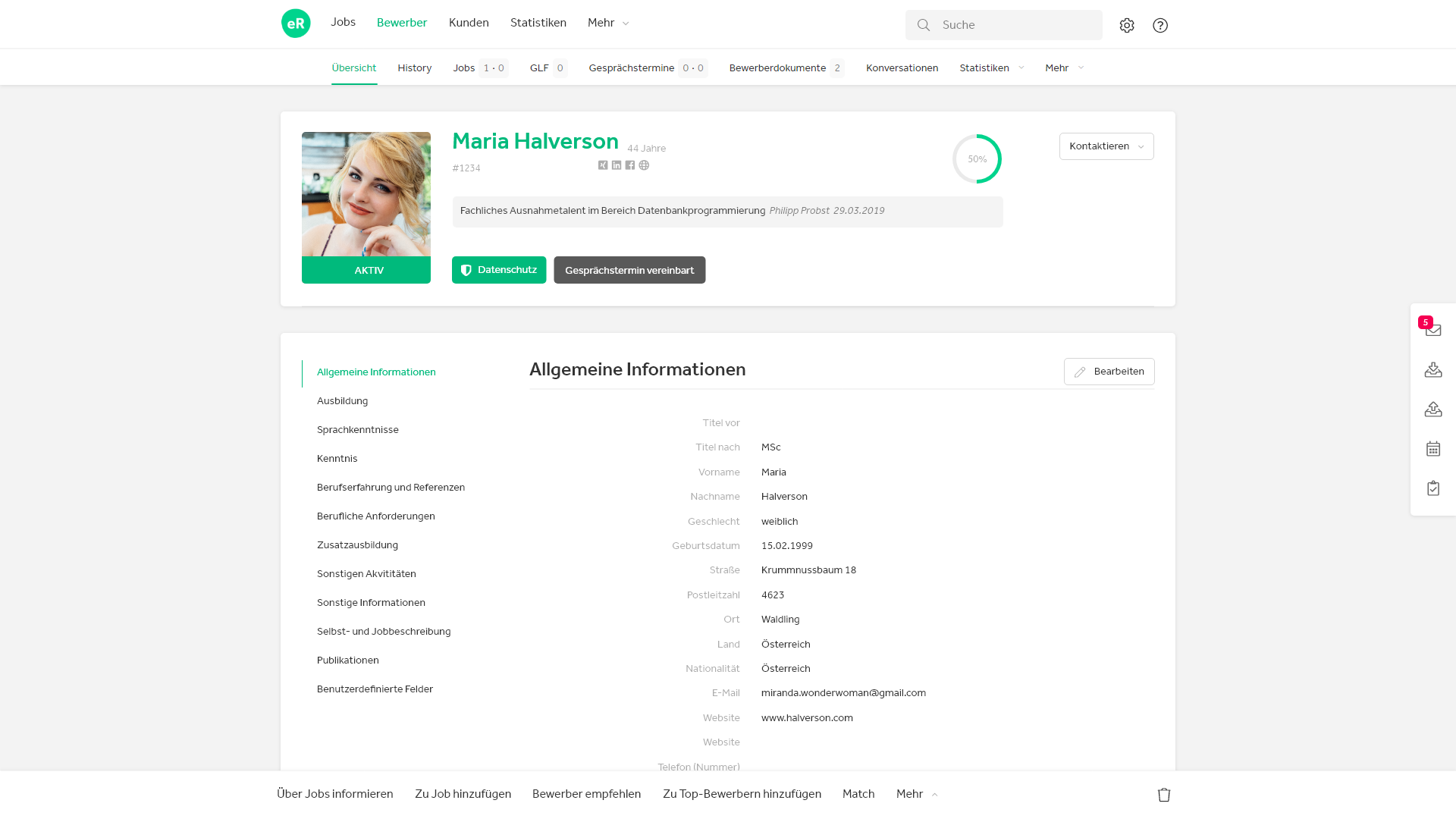
CV, Contact information & further documents
For easy access to an applicants CV a new button has been implemented. The button is only visible if an applicant has uploaded a CV.
Further contact details as well all other documents of the applicants are listed on the button to the right.
Lights
The color marks of applicants are shown as background color of the last exectued workflow step.
New Look & Feel, new User Interface
The applicant detail page, the notification center as well as the Customer Portal have been redesign according to our new look & feel.
Minor changes have been made to ensure better usability and readability.
Performance
Apart from the different look optimizations regarding performance have also been made. The most prominent change concerns creating emails during a workflow step. In addition it is possible to add documents to an email via drag & drop.